
Why your brand colours aren’t working.
- Kapri
- Oct 26, 2025
- 2 min read
When I work with small business owners, I often hear: “I just picked the colours I like.”
Fair enough. But here’s the thing, your brand colours aren’t just about what you like.
They’re about what your audience feels… and what they trust.
1. Colour sets the mood
From the moment someone sees your brand, whether that’s your logo, Instagram story, or website graphic, colour is doing heavy lifting.
Research shows that around 62–90% of initial product assessments are based on colour alone(uxcel.com).
In other words: your palette is speaking before your words do.
If your colours don’t match your vibe, they’ll create a disconnect.
2. Emotion meets perception
Colour psychology isn’t just a buzzword. Studies show colours carry associations:

However, here’s the nuance: it’s not simply “blue = good” or “red = bad.”
The key is appropriateness. Does the colour actually fit what your brand is about?
A finance brand in neon pink? Maybe not.
A wellness brand in calm green? Probably yes.
3. The palette system (not just one colour)
Picking one colour isn’t enough.
A smart brand palette uses structure:
60% main colour (background and foundation)
30% secondary colour (support tone)
10% accent colour (to draw attention)

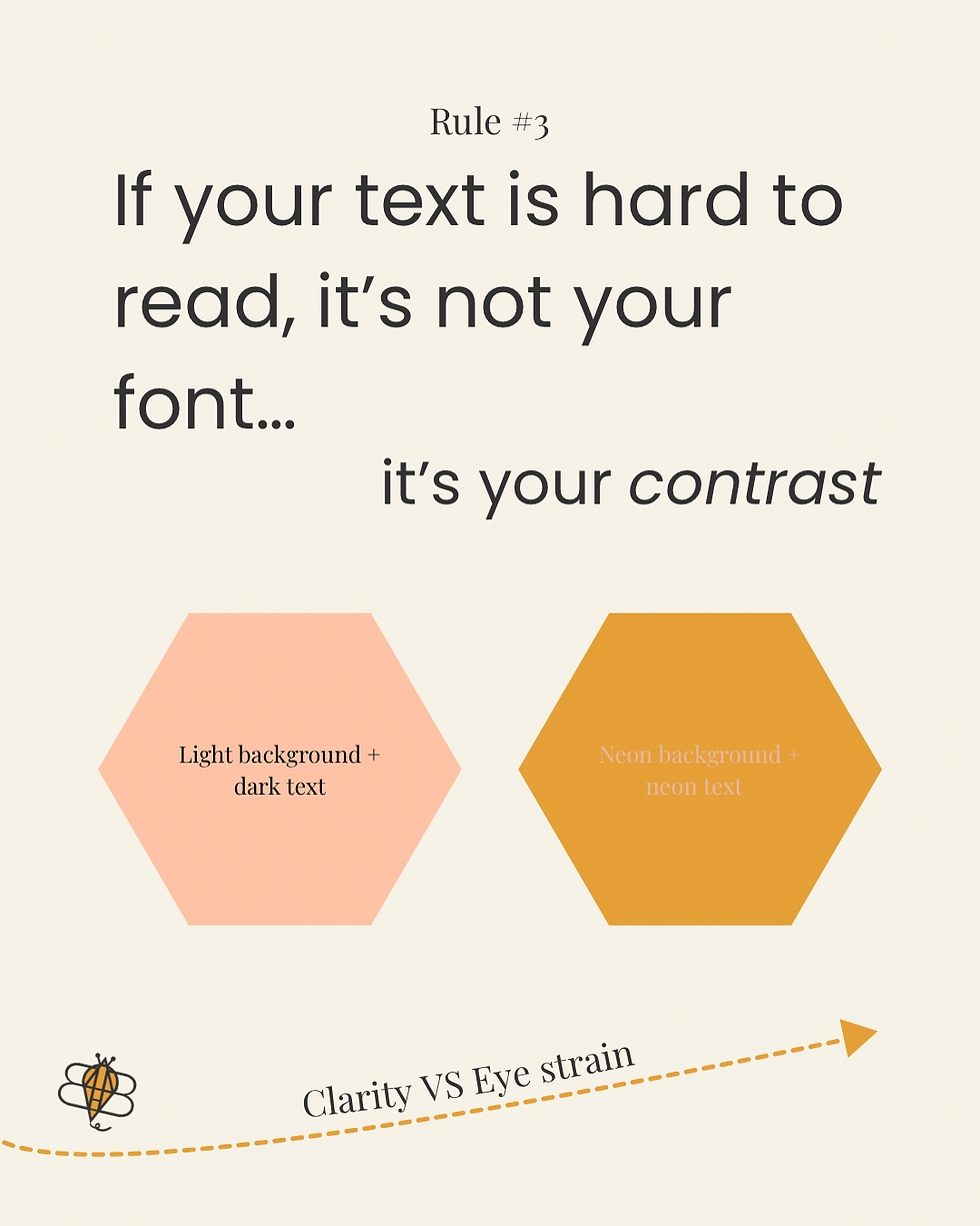
And don’t forget contrast: if your text is hard to read because you’ve gone pastel-on-pastel, no one’s going to engage.
Clarity beats trendy every time.
4. Trust is built through consistency
Here’s where the “trust” part comes in.
When someone repeatedly sees the same colours across your logo, website, packaging, and social posts, they start to recognise you.
Familiarity breeds confidence:“They look like they know what they’re doing.”
Consistent colour = dependable brand.
(BrandVM)
That means ditching the constant rebrands or colour experiments.
Message first. Tone second. Colour third.
5. Three quick questions for your next palette
Before you dive into designing, ask yourself:
What emotion do I want people to feel when they see my brand?
Does my main colour reflect that emotion and fit my audience?
Are my colours balanced (60/30/10) and easy to read in contrast?
If you can answer all three with a yes, you’re golden.
Your brand colours aren’t décor. They’re communication tools.
They quietly tell people who you are, what you do, and why you’re worth paying attention to.
Pick them with purpose.
Stick with them consistently.
And when you do? You’re not just choosing pretty colours, you’re building trust.
References
“Color Psychology in Branding: The Persuasive Power of Color.” Ignyte Brands
“Color Psychology in Marketing and Branding is All About Context.” Help Scout
“The Psychology of Color and Its Effect on Branding.” Egyptian Journal of Business & Tourism
“Color Psychology: How to Use it in Marketing and Branding.” HubSpot Blog
“Brand Color Psychology: How Hues Influence Emotions and Behaviours.” BrandVM

Comments